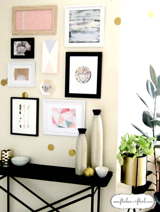
I have been lusting after gallery walls for a really, really, really long time (as mentioned in this post), and I’m so excited I’ve finally got around to doing one! It was so much easier to do than I thought it would be, and makes this otherwise awkward wall into a bit of a wow space – which is perfect, as it’s one of the first things you see when you walk through the front door.
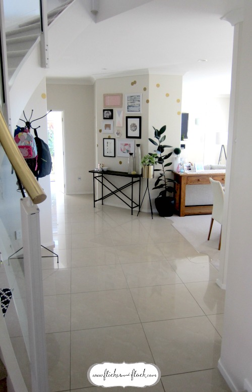
The open plan layout + general flow of our house is ideal for a busy family, but our main hallway is an unusual space with contrasting + mismatching lines + edges + curves (as seen in the below pic). As such, I’ve started to use clusters of objects + carefully placed soft furnishings to better define our living spaces. For example, I’ve laid a long black + white jacquard rug under the stairs (which you can just see peeking through in the bottom left of the below pic), and use this area as a little play cubby for the kids. All of their bigger toys like the toolbench + supermarket are tucked in here out of the way, which minimises clutter in our main living areas yet gives them a cosy place to play that would otherwise go unused. Likewise, I’ve decided to make the [totally pointless] angled wall straight ahead of the front door into a bit of an entry display to set the tone for our home. Here’s where the beautiful gallery wall comes in! I found the black iron console first + fell in love with it, and am so pleased with how the gallery wall has turned out as I think it just completes this open space.
I should point out, gallery walls are not just reserved for big spaces or big walls. The wall space I used was about 1.2m x 1.2m, and this gallery layout has actually made the whole space feel larger and the ceiling higher. Each piece of art doesn’t need to be the same size as each other or evenly spaced or perfectly level with each other for it to work (mine certainly isn’t!), so don’t be fooled into thinking you have to be precise to do a gallery wall. In fact, I think it works better if there’s a little bit of randomness to it. The method I’m going to share allows you to play around with the layout before you start hanging and is pretty foolproof, so you’ll be admiring your new display in no time!
What I used:
- A selection of frames + canvas + photos / prints that I wanted to hang
- Baking paper for tracing
- Pencil for marking the hook positions
- 3M hooks for hanging
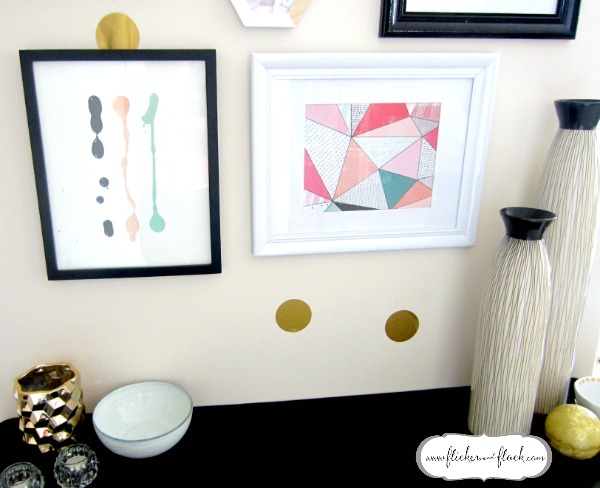
- I also used Resene Cosmos, Resene Alaska, Resene Loblolly + Resene Magma as the colour palette for hastily created abstract art to fill any empty frames (like this 5 minute masterpiece!)
How I did it:
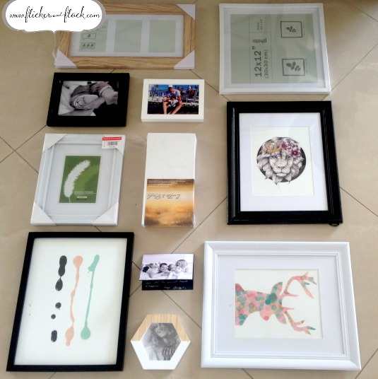
- I used a section of the floor roughly the same size as the wall area, and laid out all of the pieces I wanted to hang. It was at this point that I played around with the arrangement until it looked wall-ready.
- Once I was happy with the layout, I flipped over all of the frames so that their sawtooth hooks / picture wires were facing me. At this point, make sure you step back to ensure they’re still in the right position as you want to hang them, + realign if you need to.
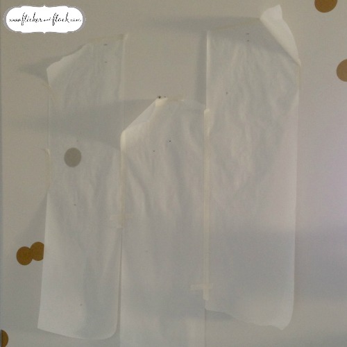
- I then placed baking paper over the pieces – I had to use three sections of baking paper side-by-side to cover the whole arrangement. You can use tracing paper or another form of sheer paper if you prefer. Then, using a pencil to mark on the baking paper where each of the picture hooks are.
- Transfer your baking paper up onto the wall in the place where you want the pictures to hang, and then use your pencil to mark the wall where you’ve marked your baking paper. Once you take the baking paper down, you should now have pencil marks on your wall to guide you on where you need to stick or nail your picture hooks into.
- Use these pencil marks to put the hooks up, and then rub out the pencil if need be. Given I was using my eye as the main guide for the arrangement (not a ruler or leveller or anything else that would make it precise) I used 3M hooks just in case I needed to make any changes afterwards, but didn’t need to in the end.
How to decide what art to display:
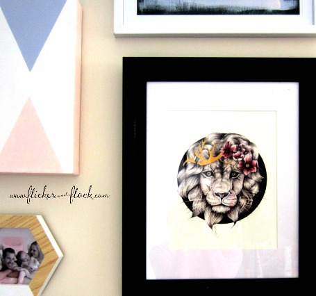
There are no rules! I’ve seen pictures of gallery walls that have completely contrasting images in every respect, that look simply amazing as a collective. Likewise I’ve seen a cluster of simple + similar images that go from basic to wow when en masse. For my wall, I used a recently purchased incredible piece of art named Luscious Locks Leo (from Auckland artist Rocco’s Room) as the hero centrepiece, and then created or chose pieces that were complementary to it.
I’m loving the peachy pinks + dusky blues of the season, so worked with this palette + added gold and greys to fit in with Leo. I’ve used scrapbook paper for a couple of the prints, another took me a mere 5 minutes using paint + paper, and the canvas to the left of Leo was easily done with masking tape to outline the triangles and then paint.
Have a play around with different colours + images + prints that you already have at home – I am sure you will come up with something that’s amazing + that you love. Feel free to share your ideas, as I’d love to see them! x
![The 5 minute masterpiece [+ how to do your own!]](https://flickerandflock.com/wp-content/uploads/2016/04/The-5-min-masterpiece_thumbnail-150x150.jpg)




Leave a Reply